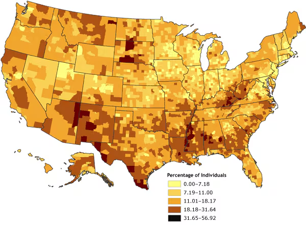
Figure 3. Percentage of individuals living in poverty, by county, 2000. Data are classified by geometric data progression. Data source: Community Health Status Indicators (1).
Map of the United States showing the percentage of individuals living in poverty, by county. Overall, the map gives the impression that there are only a few counties in which the percentage of individuals living in poverty ranges from 31.65% to 56.92% (the highest rate shown by the map), but the map also shows that there is a relatively small number of counties showing the lower percentages of individuals living in poverty. Compared to Figure 1, Figure 3 shows the United States to have more counties with the highest rate of poverty, but compared to Figure 2, Figure 3 shows the United States to have fewer counties with the highest rate of poverty.
| Range, Percentage | |||||
|---|---|---|---|---|---|
| 0.00-7.18 | 7.19-11.00 | 11.01-18.17 | 18.18-31.64 | 31.65-56.92 | |
| Number of counties in range | 321 | 803 | 1300 | 650 | 65 |
![]()
Volume 4: No. 4, October 2007