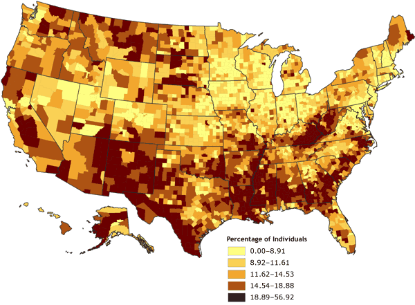
Figure 2. Percentage of individuals living in poverty, by county, 2000. Data are classified by quintiles. Data source: Community Health Status Indicators (1).
Map of the United States showing the percentage of individuals living in poverty, by county. Overall, the map gives the impression that the percentage of individuals living in poverty ranges from 18.89% to 56.92% (the highest quintile) in many counties, especially counties located in the South. Compared to the impression given by Figure 1, the impression given by Figure 2 is that the United States has many more counties with the highest rates of poverty.
| Range, Percentage | |||||
|---|---|---|---|---|---|
| 0.00-8.91 | 8.92-11.61 | 11.62-14.53 | 14.54-18.88 | 18.89-56.92 | |
| Number of counties in range | 630 | 629 | 627 | 628 | 625 |
![]()
Volume 4: No. 4, October 2007